Pernille Schou Jørgensen

06
PROJECT
Focus Brand design
Project at KEA
Project from 2020
Introduction
Rub&Stub works to promote a more sustainable food culture with a strong focus on reducing food waste. The company has inspired and supported both private individuals and businesses in making small changes to how they handle food and leftovers, and has expanded internationally in recent years.
Rub&Stub wanted a new brand identity and faced challenges with its brand name when expanding internationally, as the name is a Danish expression that does not translate directly into English. This resulted in a weaker brand recognition among international customers. We therefore made a strategic decision to develop a new brand name.
Based on Rub&Stub's needs my team and I developed a branding strategy as well as a visual and verbal brand identity for Rub&Stub.
My role
Throughout the project, I was involved across all stages of developing Rub&Stub’s brand strategy and brand identity in close collaboration with my team. I took particular responsibility for developing the verbal identity, writing the brand manifesto, creating the visual layout for the landing page, and contributing to the development of the brand guidelines.
A perspective that stayed with me
This project reinforced how crucial attention to detail is in developing a strong and coherent brand concept. Small decisions in visual and verbal expression carry significant weight and directly shape how a narrative is perceived and understood.
I learned that when visual design and language are aligned with care and precision, they can tell a clear and intentional story — one that feels consistent, credible, and meaningful across every touchpoint.
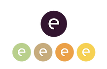
New brand name
Primary logo
Secondary logos
Brand strategy
WHY ARE WE HERE?
We will make sustainability achievable for everyone
WHAT DO WE DO AND HOW DO WE DO IT?
We promote food waste reduction based on the customer’s premises, including through workshops, events, lectures, and projects of all sizes.
WHAT MAKES US DIFFERENT?
We tailor our solutions to each individual customer’s needs. We are not a ‘one-size-fits-all’ solution.
WHO ARE WE HERE FOR?
Our core target audience consists of individuals, both private and professional, who want to reduce their food waste and thus contribute to minimizing their carbon footprint.
WHAT DO WE VALUE THE MOST?
Curiosity, responsibility, community, flexibility, and creativity.
WHAT’S OUR PERSONALITY?
We are honest, curious, and creative. We work passionately and purposefully.
OUR AMBITION
We aim to challenge and transform the global approach to food waste and rethink how we optimize the use of our resources.
Verbal identity
The tone of voice derives from the brand strategy and is meant to convey the brand’s personality across all text and visual storytelling.
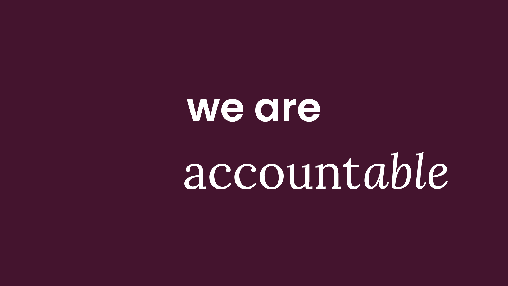
In developing the verbal identity, we broke down “Eatable” to explore how it could be used to express their personality. It became clear that the suffix “-able” holds significant potential. “Able” itself means “capable of,” which aligns with their business strategy of being able to create solutions and drive change. To craft a narrative around their core business and purpose, we wrote a manifesto playing with the suffix “-able.” This narrative is designed to reinforce the brand image with the target audience and should be an underlying thread in everything We are Eatable does.
Tone of voice
Grounded. We meet people on their level. We use an informal tone. We are always ready with open arms. Passionate. We demonstrate confidence. We encourage action through our language and listen attentively. We put our heart into everything we do and say. Creative. We speak to people’s senses. We enrich our language with adjectives. We invite them into our food universe.
Brand manifest
The climate is vulnerable. 30% of all our resources are wasted. That is not acceptable. We believe that our food culture is changeable and we are all accountable. We believe that all surplus food is usable and it is doable for everyone to make it eatable.
Our agenda is uncompromisable and we are trustable in our mission to reduce food waste in a suitable way. Our road towards change is customizable and manageable. Because we want to show you that you are capable of thinking eatable.
we are eatable.
Visual identity
The choice of colors for the visual identity is inspired by natural hues from fruits and vegetables. These colors are used as background colors and for ”their line.” Each color is named after the fruit or vegetable it represents. By naming the colors, it becomes easier to align everyone’s understanding of the colors when creating new communication and branding materials internally within the company.
Primary color

Eggplant
CMYK: 66, 89, 44, 63
RGB: 61, 27, 49
Hex: #3d1b31
Secondary colors

Lemon
CMYK: 0, 18, 91, 0
RGB: 255, 209, 21
Hex: #ffd115

Orange
CMYK: 0, 45, 93, 0
RGB: 255, 159, 0
Hex: #ff9f00

Ginger
CMYK: 17, 29, 58, 5
RGB: 211, 176, 118
Hex: #d3b076

Apple
CMYK: 32, 4, 61, 0
RGB: 191, 210, 128
Hex: #bfd280
One line illustrations
Based on the entire verbal expression, all words were defined according to the business strategy and brand personality and translated into the new visual identity. Words like ”customization,” ”creativity,” and ”food” were focal points in the creation of ”their line.” This line helps create a creative space, making the brand easy to decode and enhancing brand recognition. The line consists of illustrations of fruits and vegetables. The expression and development of this line stem from the concept of customization. Therefore, the line in the illustrations is a ”one-line illustration,” as if it were a thread.
Typography
Primary typography
Poppins
Regular
a b c d e f g h i j k l m n o
p q r s t u v w x y z æ ø å
1 2 3 4 5 6 7 8 9 0
Semi bold
a b c d e f g h i j k l m n o
p q r s t u v w x y z æ ø å
1 2 3 4 5 6 7 8 9 0
Secondary typography
Lora
Regular
a b c d e f g h i j k l m n o
p q r s t u v w x y z æ ø å
1 2 3 4 5 6 7 8 9 0
Bold
a b c d e f g h i j k l m n o
p q r s t u v w x y z æ ø å
1 2 3 4 5 6 7 8 9 0
Website

We are Eatable’s landing page lacked user-friendliness, and consumers found it difficult to understand what the company does and how they could get help to reduce food waste. We decided to nudge users by splitting the landing page into two sections: ”We are Privates” and ”We are Businesses.” This approach guides users more effectively and makes it easier for them to navigate.Additionally, the colors, line style, and illustrations are consistently applied to reinforce the brand identity and enhance recognition. The tone of voice plays a crucial role, with ”We are” used on both sides, activating We are Eatable’s new name and creating a clear emotional narrative around community and shared responsibility. This approach emphasizes that together, we can make use of all the food that might otherwise be wasted but is still edible.
Brand guidelines book


The brand guidelines handbook was customized to ensure consistency in the brand’s identity across all verbal and visual communications. It serves as a rulebook and checklist, containing a detailed description of tone of voice, logo, illustrations, image style, typography, etc.The visual identity and tone of voice are applied throughout the handbook without exception, to provide inspiration and support all the guidelines described within it. The brand style guide is included in the appendix of this portfolio.